Thursday, February 17, 2011
Thesis Critique
During my critique, I was able to show my group the pdf files of my Self Archive book. Last semester, my group looked at my PSA series posters about raising awareness for cultural misunderstanding. The Self Archive book I presented to the group shows a documentary of all the artists and images I've looked at that gave me inspiration to my recent design projects. I also started talking about designing graphic T-shirts due to misinterpretation of translation through commercial slogans and well-known brands/advertisement. I want to mess around with the translation of the commonly known famous brand slogans and make audience become more aware of culture misunderstanding. When people travel to other places outside of the US, they can see signs on the street from different stores often have English translation next to or under the title of the store in its own language. Most of these chances, the translation to English is corrupted and sometimes they might even create misleading meanings. I want to create series of graphic T-shirts to emphasize on the bad translation, corrupted slogan designs.
Wednesday, October 27, 2010
Annotated Image Gallery

Ji Lee's Suggu ("Mix" in Korean) is a new alphabet mixing Hangul(Korean Alphabet) and Roman Alphabet. Because they are both Phonetic Alphabets—a writing system based on a set of symbols representing different sounds—mixing the two is possible and easy. Combine Roman Alphabet's consonants (B, C, D, F, G...) with Hangul's vowels (ㅏ, ㅑ, ㅓ, ㅕ...). That's Suggu. Project by Ji Lee, Sue Park / Font Design by Yi Kyung A
I think this design project is very interesting because it integrates two languages, korean alphabet and english alphabet and make it into an useful existing typography that is communicative. This inspired me for my New Cliche's project. This project combined two kind of existing culture. I think languages has its own culture values.

The digital age has transformed the ways in which we communicate with each other. The combination of technology and power of information brings new ways on HOW, WITH WHOM and WHY we communicate. We are connected with more people than ever before. Do more options to communicate with each other connect us or alienate us more?
This project is really explicit in terms of the changes and how transformation of communication between people in modern society. even though it does not have to do with cultures merging and possessing multiple cultures, this design is funny and smart idea. I enjoy design with series that can be combined and projects a main concept.

United states of korazil


WENS
All typefaces for Latin alphabet are designed to be used for the conventional left-to-right reading direction. WENS was designed for reading and writing in four directions.


Univers Revolved
To form the letters of Univers Revolved, a simple geometric formula was applied to the capital letters of the widely used Univers font. With the help of a 3-D computer program, each letter was revolved 360° around a vertical axis drawn at its left-most point.
Unlike the letters of our standard alphabet, those of Univers Revolved are bilaterally symmetrical and may therefore be read in both left-to-right and right-to-left directions. And because they are three-dimensional, they can be stacked, arranged in circles, or set in motion; they can become toys, pieces of furniture, buildings, or chocolate candies.
Revised Focus Statment
Focus Statement
My thesis focus is going towards the direction of visual transformation concept of transitional stages within multiple cultures. I want to focus on how people inherit and adapt to culture(s) and how cultures is always in the state of “merging”. From here, I want to develop visual concept on the idea of two visual aspects merging and playing into each other’s part. I also want to emphasize that there is no defining line in transitional stages. The transitional stage of culture merging can be visualized as a gray scale; there is no such section as just black or just white. However, there is the mixture stage that is blurred and almost unclear to the identity.
Sunday, September 19, 2010
2010 WLCM BCK Show Review
The WLCM BCK show consisted of art works by the Mason Gross School of the Arts MFA Graduates. This show has no specific main theme, there are 41 artist’s work represented at this show. They were asking to submit small to medium size work for this exhibition. I have picked in total of 4 pieces of artwork that I will be discussing about in details.

This work is called CNC, 201 by Wendy White. The medium is Acrylic on canvas with the dimensions of 37.5” x 43. This work caught my attention first because of its untraditional canvas shape on the top and also with its bright multi-colored canvas. Wendy teaches painting for the BFA students at Mason Gross. I heard that she deals with graffiti art as well. It seems like in this painting, she did not have to use a paintbrush to produce this work. The acrylic color that seems by the number 23 looks stenciled on. With the background of black spray-painted over the whole piece really makes the whole painting sticks out. I find this work very interesting also from the canvas bars that stuck out on top, it almost looks like a skateboarding staircase railings. This piece really suits the kind of graffiti artwork you would see near the skateboarding places in a park.

This piece is called “Fuller Landscape (Dymaxion Dweling Machine/Wichita House)” and the artist is Julie Langsam. The medium is oil on canvas. This piece should be my favorite piece in the whole WLCM BCK show. Even though I do not quite know what the theme this painting is about but I can tell that it deals with architecture in the future. The Wichita House seems like it is a kind of transportation similar to subway that transport along the red and orange gridded squares. The Wichita House is so small compare to full size of the canvas; it really makes you focus on the details in the architectural house, which is the main focus of the painting. The sunset sky creates soothing dynamic warmth to the whole painting with the harsh bright red, hot pink, color blocks on the bottom. It is almost like two different kind of dimension interacting with each other. The drawing of the house and the ground seems so futuristic and unrealistic, but with the realistic sky, it can be view as a futuristic landscape painting of future architectures.

This painting is called Checkpoint, 2010 By Caetlynn Booth. The medium is oil on linen on wood panel is dimention of 16’ x 48’. I noticed this painting next to the “Fuller Landscape” painting because I think these two works really compliment each other in terms of its abstract use of geometrical shapes and angles. A lot of diamond shaped crisscross pattern is going on here, which creates this 3D texture and turn it into landscape. The landscape seems like it’s a view from looking down on the ground. The blue paint on the bottom seems like water that’s spilled and left on the foreground and its sipping part of the painting on the very bottom. The more I look at it, the more I think it looks like a sidewalk and the curb of the street. However, I’ve been trying to figure out what the red on the right top corner is. This piece is made of mainly crisscrossing from two angles but it has a certain depth perception in it. So that is why I also considered this painting to be landscape as well.

This last piece is exhibited in the tribute show to alumni of Mason Gross who past away and created scholarship fund. This piece is work of art by Lyda Craig. “Untitled, 2000”. The medium is mixed media on panel. I chose this piece because I think it has unique use of medium. The artist used paint and threads from sewing with all mixtures of colors and seems to bundle them all up into a thread ball. From far away, it looked quite disturbing because at first I thought it was a ball of hair hanging of canvas but when looked close the details of the thread intertwine and tied to each other really complicates the whole painting to something different. I’ve always enjoyed work that adds other type of man-made product or any items to an canvas, it makes the painting looks like there is more to it than just paint on fabric. I think this work chose good use of medium and used it with freedom. Even though the brushwork is more messy and thick, some looks like splashed paint. With the mingled up threads kind of messing with the whole composition of the painting, ended up creating a very scary looking painting that sucks you in. I think it’s ironic because threads are usually used to for sewing cloths together. People usually think of “neat” when they think of thread. But when I think of thread, I think it’s a mess because every time when I take thread box out of my drawers, all the different colored threads are all tangled up with one another and its just a big knot. That kind of visualization popped up in my head when I saw this painting
Thursday, September 16, 2010
Peer Interview with Byron Escobar
Interview with Byron Escobar
Concentration: Graphic Design
Concentration: Graphic Design
Thesis Interview
We began our interview by opening up sketch books and going through each others’ web portfolios and blogs. The following is our discussion upon reviewing some of our recent work.
Byron: Wow, I didn’t realize you did this!
We began our interview by opening up sketch books and going through each others’ web portfolios and blogs. The following is our discussion upon reviewing some of our recent work.
Byron: Wow, I didn’t realize you did this!
Me: What?
Byron: The MAD logo redesign process page [Referring to the floor plan connection]
Me: Yea, the logo shape was base on the floor plan of the museum, I wanted to go with the idea of the arts and craft template concept. that is why I decided to use the floor plan as the fundamental shape for the MAD museum logo
Byron: The process layout that you have up on your website is really interesting. I guess I should have paid more attention to your progress on the project in class. I dig it Jenny! =)
Me: I would have showed you my ideas but you almost never made it to class. :P
Me: For the odd sensation book, why were you not able to photograph the 3 different endings? I realized the photographs of the two dudes drinking coke-diluted whiskey was all photographed by you of your friends.
Byron: I meant to have some sort of hand in all the content in the book including the images. I called up a few hospitals to see if they would let me photograph an empty recovery room and everything seemed like it would play out nicely, but I just never got around to setting aside time to photographing the endings. I really wished I could have, but in the end the message was still there and to my relief did not lose much of its intended impact on the rest of the class
Me: I think the images from the ending of fire and water looked really awesome, and it definitely made a good point
From looking at your portfolio website online, I see you are very interested and involve with photography. What sort of theme or topic do you usually photograph and have you thought of integrating your photographs in your design thesis?
Byron: Photography is great. I have supplemented my Graphic Design studies with a lot of Photo exposure during the course of the last 3 years. I realized I enjoy portrait photography the most because of the interaction with the subject, thematic elements and relationship that is built from the whole experience. I definitely want to include my own photo work in my thesis, but I will let the content and concept of the project determine whether or not it needs to incorporate photo.
Byron: You sometimes have work that involves some sort of Chinese or Asian aesthetics. Are you interested in making work dealing with cultural issues and identity?
Me: I've been thinking about my focus in thesis, it is going to be focusing on transitional periods through cultural and how my identity has been "merging". From there, I have been trying to come up with visual concept on the idea of two aspects merging and playing into each other's parts.
Byron: So I'm on the right track!
Identity and Culture hmm.. Would you like to focus the project more heavily on informative design work or something a bit more subjective to the viewer and I guess personal?
Me: nawh I don't think I will do anything related to informative design i thought about incorporating painting, using oil as medium and also graphic design
Me: I wanted to focus on how there is no define line in transitional stages. It’s almost like on the gray scale, there is no line that jumps from black to white. There is a stage in between that is blurred.
Me: Where do you think your focus for thesis is leading you right now? Have you come up with any initial plans?
Byron: I've been reluctant to talk about my thesis because it sprouted from a reading this summer called World War Z. It's a novel about the oral history of the zombie apocalypse and the accounts of the survivors after the "Great Panic"
Me: Zombies huh? My favorite!
Byron: I got my idea from a certain chapter that dealt with the effects of film on the public both psychologically and socially. Then I started thinking about the concept of a virus and paralleling that to the concept of and idea---INCEPTION. I want to get into mass media, propaganda, viral imagery, and subliminal messaging as a few topic points to begin my research.
Me: I haven't watch INCEPTION yet, but isn't it all about imagination and things that goes on in Leonardo’s head?
Byron: Hahahaha YOU HAVE TO WATCH IT…I will download you a copy!
Me: Make sure its dvd rip!
Byron: …which goes back to what I was talking about the accessibility of information
ya dig?...everything is so easily spread these days There is a vehicle that allows things to move about the masses, and that’s the Internet. That’s one path I can take with it…what I'm also interested in is exploring the effects of imagery, information, media, etc. on people. More specifically, on people and socially and psychologically when there is lack of structure, (post apocalyptic). I feel like I could find a lot about emotional and cognitive responses to intelligent design.
Byron: The character in the book I was telling you about made short films about survivor accounts of the zombie apocalypse and by doing so the rate of certain psychological disorders went down in the towns that screened his films. The government later captured him and gave him resources to continue making these types of films to renew hope in the people.
Byron: I don't have an idea yet, I guess. I just have a direction I want to take.
Me: Good start Byron! I can't wait to see where this is going to bring you. You really do have a lot of good ideas flying around. Yea, we all need to do more researching on our ideas to take us to the next step. :(
Byron: Now hahaha tell me more about your idea? Have you seen or read anything lately that stirred some thoughts up?
Me: Nope. I haven't really seen anything related to what I want to do. I will have to keep looking into it. I fly to china and fly back here a lot, and I see a lot of different things in between. I just want to be able to turn all my cultural and identity aspects into some visual concept
Byron: Hmm...You said you don’t want to do anything design related...Are you open to any medium at this point?
Me: I do want to do something design related. i want to incorporate painting and design element into my thesis work if possible.
Byron: Oh right.
soo..
Me: What else would you like to know about me?
Byron: I feel like we need to advance our ideas a bit more
Me: I want to focus on cultural changes, identities merging. But I DONT WANT to do anything just related to identity. You know what I mean?
Byron: So cultural diffusion
Over time
Your time
Me: That makes sense.
Byron: All right, yo. This has been pretty good. I have a better idea of what you want to do
Me: Okay, Byron.
Monday, September 13, 2010
Water Exhibition Review from the ZImmerli Art Museum
The water exhibition at the Zimmerli Art Museum was an interdisciplinary exhibition with works related to the theme “Water”. The curator was able to find many artists from other universities through out the country who made make use of the theme “water” to create their art work in different ranges of medium and have their work exhibited at the “Water” show. My initial thought of the “Water” exhibition was a lot different then what I had expected from the real thing. Base from the previous show I’ve been in Zimmerli, I thought this “Water” show was going to be exhibiting mostly paintings or drawings of natural landscape with water being its related theme. However, when I got there, the first sculpture that strikes my attention suddenly clearly changed my opinion on this exhibition. The sculpture instillation in the main lobby of the “Water” exhibition was called “Ice and Ark” made in 2009 by Ross Cisneros. The medium of the installation is with plastic bottles, water and fishing nets. The curator had told us that the fishing net is filled with water bottles on the bottom, with 200 bottles of this water called “Berg” which is water collected from melting glaciers. This idea create curiosity amongst audience and it also raises the awareness of global warming, who owns that water and water rights, etc. I thought the exhibition was a lot more environmental and focus around the scientific aspects of water instead of just artist’s different style of how they represent water in their visual art works. There were many unique and creative use of medium for the sculpture installations in order to fully render the visual representation of water. In the brochure, it mentions “Water is essential to life on earth”, the exhibition use this idea to present water in how it can be use, how it can be watched, how it can be described using multiple metaphors, and how it is something we cannot live without in daily life. All in all, I think the exhibition was arranged really well, with its specious space in the gallery, I don’t think that any work were being unnoticed or given less attention then others. The arrangements of the art works were very suited and appropriated especially for the last section of the exhibition. The installation of 78 framed photographs in three rows called “Fountains” by Diane Neumaier and also “Piaus” by Atul Bhalla of the 20 photographs of old/almost non-used water foucits from Tibet. I just thought having those two works next to each other really complimented on the idea of water resource of where our drinkable and use water comes from; either faucets or drinking water fountains. This idea focus around the extend use of our civilization with water on how human took use of water in their living areas, cities, suburban towns, tour sites, etc.
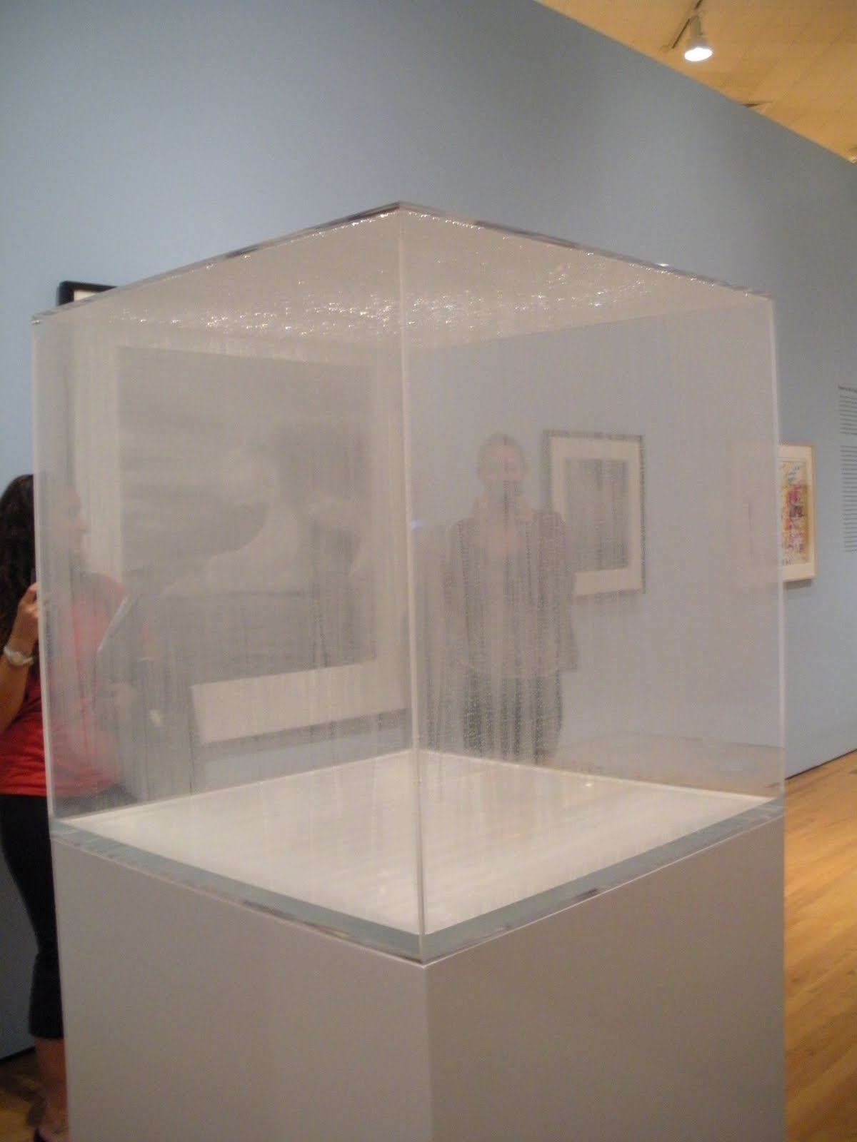
Condensation Cube

Ablution

Haiti Photography series (Sodo Haiti, St. Yves, Haiti, Sodo, Haiti)


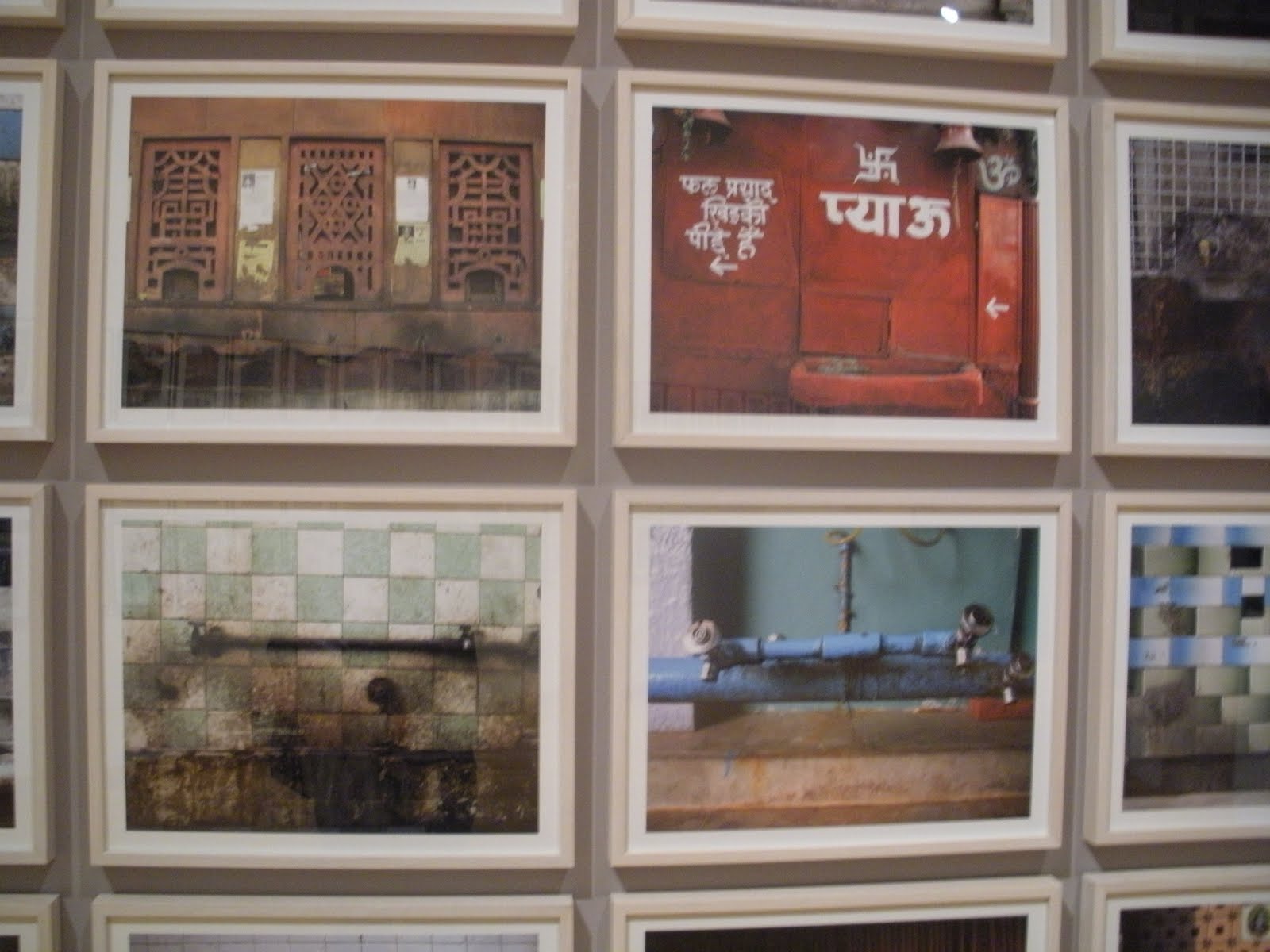
Piaus
Sunday, September 12, 2010
Currently overwhelmed..
Hi all,
This is my new blog for my Design III and Thesis & Exhibition class. Thanks for dropping by! so it seems this is officially going to be my last last year at Rutgers. SUPER SENIOR it up all the way!
Love,
Jenny
Subscribe to:
Comments (Atom)